My Friend Ben Bates and I had a discussion about The difference between the Screen Tone that gets used in Manga and the halftone feature in photoshop. I have been using the half tone dot pattern that is found under Filter> Pixelate> Color Halftone. You can see the results below. What I like about it is that it approximates the look of vintage coloring/toning processes. What I don't like about it is that at different scales on a computer monitor it has the tendency to moiré.
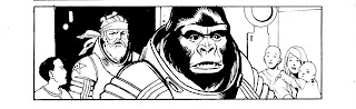
This is an image from a short story I'm doing for an anthology. It is full of all kinds of crazy imagery, and even with my best efforts to separate forms with careful design, I still want to use a middle tone of some sort to help direct the eye. The dots print perfect in black and white because that's all they are; just spaced at different intervals. I'll post a screen of the same image and those of you who feel like commenting can give me a thumbs up or down.

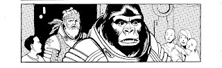
 This is an image from a short story I'm doing for an anthology. It is full of all kinds of crazy imagery, and even with my best efforts to separate forms with careful design, I still want to use a middle tone of some sort to help direct the eye. The dots print perfect in black and white because that's all they are; just spaced at different intervals. I'll post a screen of the same image and those of you who feel like commenting can give me a thumbs up or down.
I've read the script for this story, and cannot WAIT to see it completed! Art is looking great!
ReplyDelete