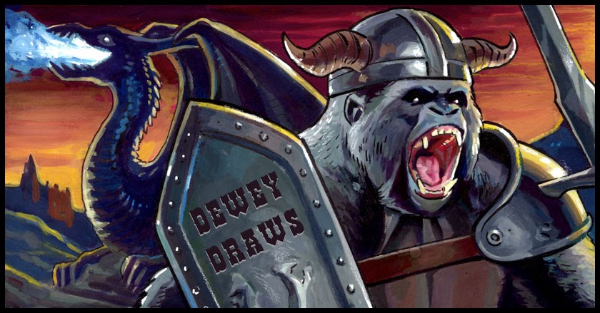
I wanted to make a unambiguously pro-Lady piece this year, for Emerald City Comic Con's "Monsters and Dames," that spoke to my love of rock music, mutants and guitars. I modeled the frontwoman on
the girl from 27b/6 because she looks cool enough to shred on a yellow lightning V and I based her band on the two Papo figures I keep at my desk because I always thought they looked like they'd make a bad-ass rhythm section.
 The piece in the book will be a slightly cropped version of this image. I'll be offering prints right away in the event that it doesn't get included. If it does: then I'll have to wait until after the book comes out.
The pencils/inks were done analog and the coloring done on a cintique. I like being able to knock figures back in space with a gradient or two because it helps establish another layer of depth. One can do that with line quality too but the effect is more pronounced when the intensity of your inks varies in accordance with the depicted figure's location in space.
 Come see me at the upcoming Emerald City show and pick up a copy of Monsters and Dames (proceeds go to Seattle Children's Hospital.)
 I think that my sketch had some nice energy. I wanted to preserve that, but by choosing to utilize more detail, which I did in the final image, there's a tendency to dampen one's initial spark. The freedom and fun of unrestrained cartooning is why I tend to prefer seeing the fantastic 4, for example, drawn by
Mike Wieringo with his naturally bouncy line. That same context with its' potential for aesthetic quirks is a slightly awkward fit for a realist like
Bryan Hitch who tends to put his emphasis on design and details that are based on natural forms. In contrast, I love seeing Hitch draw something gritty and cinematic like 'Ultimates.' I just have to learn to give myself permission 'not to draw' when I can say just as much with less.
I'm slowly working more cartooning into my drawing because my favorite artists have demonstrated that a fusion between the strong parts of realistic drawing and the flexibility of cartooning have great potential for exciting storytelling. Detail can be helpful and realism has uses but I want the sort of energy that
Stuart Immonen's work displays and the grace that
Terry Dodson's work exhibits. Those good qualities come from their particular (hard won) stylizations, not adherence to strict rules of observational drawing (though it does seem clear that they have both practiced that part of drawing quite extensively.)