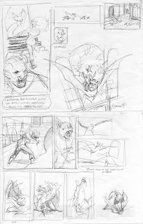
I found out a couple of things that I'll share with you about how to work through similar issues.
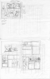
1. Define the central theme for the page or sequence before you start drawing:
In this case Nathan and I wanted to give our Character Bloar a chance to shine. I wanted that to happen with him in a kind of rodeo scene with a giant bat and have the final aspect of that sequence involve a rich visual of where we make use of the setting. The problem initially was that I hadn't set up those goals very clearly so I wasn't efficient. Once I laid it out in simple terms my objective became more clear.
2. Keep the storytelling clear:
There can be a temptation to succumb to gimmicks. I had all sorts of ideas in mind that would look 'cool' but would ultimately have scattered the themes I wanted to convey by introducing too much. If I remind myself that the point is to forward the story then it becomes evident that some visuals will take the reader out of the narrative and cause them to focus on formalism. I want the reader to forget that they are reading a comic and feel immersed. If I fail in that then the drawing was not well conceived.
3. Let panel shape and size be your guide:
once you have an idea of a strong theme and a clear panel to start or finish with you can trust in that image and begin to orient the other images on the page. I liked the function of along vertical for the first image which helped determine what the shape of the others would be. I could take the raw materials from my thumbnail drawings and fit them into that grid. If possible. give your self a lot of room to breathe (6 panels or less tend to work out best.) If not then switch up the scale and keep the layout 'boring.' Once you start to get crazy with panels all bets are off and you might as well ignore my first two points.
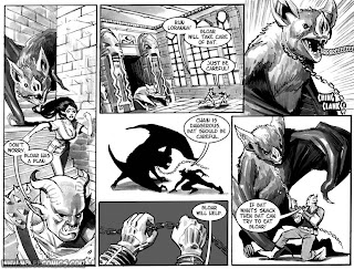
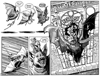
I was able to triangulate between these 3 points to layout a page I was satisfied with. In the future I'm going to try and keep these things in mind and I offer them to you in the hopes that you'll treat them like a jolt of focus when your creative batteries are tapped out.
No comments:
Post a Comment